SPICE User Guide
Orientation
After a short overview of the SPICE features, each piece of functionality is explained in detail. If you scroll down beyond the detailed instructions you will also find video clips demonstrating each feature.
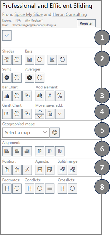
The first section of the add-in provides some space that will be utilized for notifications and error messages.
The second section holds the Data Shapes features. This turns a regular shape into a shape that will have the fill color or size defined by the value entered in the shape. See more details below.
The third section provides a new way of building a complete bar chart with great flexibility and including difference arrows between bars to illustrate and emphasize changes between categories or periods.
Section four provides a set of features to insert and modify a Gantt chart.
Section five allows you to select a geographical map from a selection of maps and click the button to insert the selected map on your slide.
Section six is for aligning shapes. This is similar to the native functionality in PowerPoint, but alignment will be made to the role model shape – the shape you select last
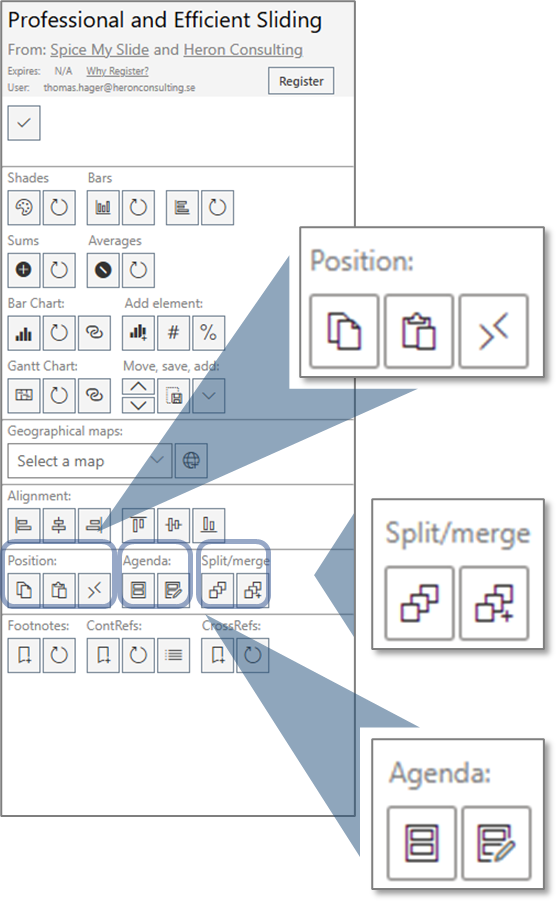
Section seven offers a few different functionalities; Positioning of shapes, Agenda and Split / Merge textboxes. These functions will be explained in more detail further down.
Last section is all about References. This is a comprehensive set of functionality that provides support for footnotes and cross references in a similar way as you are used to see in Word. We also offer a very clever type of “hashtag” references that we call “Content References”. This let’s you cascade changes of frequently used pieces of text or numbers throughout your presentation. More details below.
Data Shapes
You can think of Data Shapes like simple charts. A shape that will have some characteristics (size and fill color) defined by the value (text) you enter.
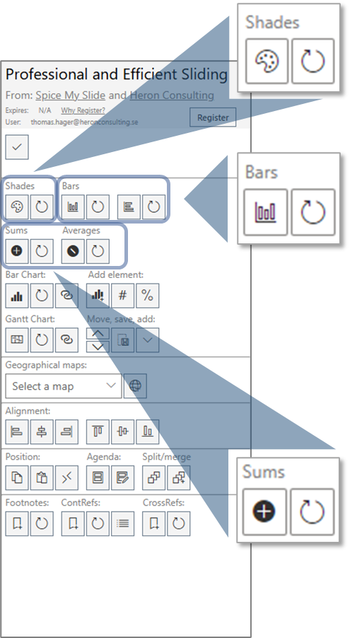
Shade Shapes
This will give the shapes you select the color shade according to the value they hold. The scale of shades and values are defined by your legend shapes where you specify with a shape representing the lower limit color and associated value and a shape representing the upper limit color and associated value. So both these shapes should have a number value and a color that matches that number value.
First select your start shape (that has a value and color to reflect that value), then select your end shape (that has a value and a color to reflect that value), then all other shapes that should inherit the color scale (use Shift or Ctrl to select several shapes). Click the “Set Shade Shape” button and you will see all your shapes inheriting the color scale from the start shape and end shape.
When a Shade Shape has been created as described above the value of the shape can be changed and the color will be adjusted according to the new value. Use the “Refresh Shade Shapes” button to update the color to reflect the updated value of the shape. This will update the color for all Shade shapes on the slide. You can also copy an existing Shade Shape and this new shape will inherit all the capabilities and color scale settings from the first shape.
Bar Shapes
Bar shapes are like very simple (=flexible and easy to use) bar charts. Select a shape with a number value and a size (you use either the horizontal or vertical alternative) that goes with the number value and click the “Set Bar Shape” button. If you now change the value in the shape and click the “Refresh Bar Shapes” button you will see that the height or width is updated to reflect the new value. You can also copy the bar shape and the new shape(s) will inherit the same scale attributes and after changing values in any of the shapes, the size will be automatically adjusted after clicking the “Refresh Bar Shapes” button.
Sum and Average Shapes
Yes, that is exactly what it is. A sum shape will present the sum of all related shapes and an Average shape will present the average value of all related shapes. First select all the shapes that should be included in the Sum or Average. Then select the shape that should present the SUM or Average value and click the “Set Sum Shape” or “Set Avg Shape” button. After changing any of the values in the related shape the Sum or Average shape value is easily updated with a click on the corresponding Refresh button. This will refresh all the Sum or Average shapes on the slide.
Combinations
Keep in mind that you can also combine the different data shape features. For example you might want to have a bar chart that further emphasizes the differences between categories with a color shade. You might also want to use the Sum or Average shapes to build a summary slide of underlying slides. The Sum and Average Shape values are connected to the related shapes even if they are moved to a different slide and will show the updated value after clicking the Refresh button. A good way to avoid inconsistencies between slides and to reduce the manual effort in keeping numbers aligned between slides.
Bar Chart
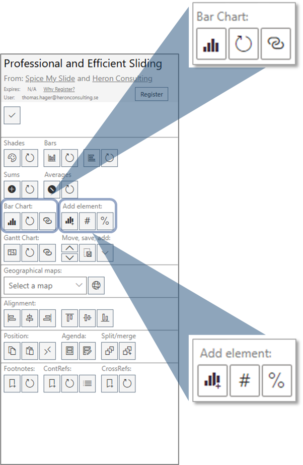
The first button will insert a simple one-bar bar chart on the slide. This is a group of shapes with some special features. When you work with the chart shapes, they might become misaligned and separated. Nothing to worry about – this is what the Refresh button is for.
The Refresh button; just select any of the shapes related to the chart and click the button and everything will come back to the right position and proportion. You can change the bar width of the chart by just adjusting the width to what you want it to be on any of the bars – then click refresh (while the updated bar is still selected) and all bars will be updated based on the selected bar as a role model. We use the same approach for updating the height of the bars – the value-height ratio of the selected bar will be applied to all bars when you click the Refresh button.
If you want to change the width of the chart – just pull the axis to the right width and click Refresh (with the axis still selected) to bring everything together again. The axis also defines the position of the chart so if you want to move the chart, you just need to move the axis and the rest will follow (after Refresh).
The “Remarry” button is used if you copy an existing chart. In such case you will need to redefine the relations for the new set of chart shapes. This is done by keeping all the relevant shapes selected and clicking the “Remarry” button. After this step the two charts are independent and can be updated separately without any interference from each other (which would be the case without the “remarry” step).
Add Element
We can add new elements to the chart. The first and most obvious one is to add another category along with another bar. Just select an existing category label and click the “Add Category” button. The new category and bar will be inserted to the right of the selected one.
The most obvious advantage with this way of building a bar chart might be the possibility to add a difference arrow between bars. Something that is not available for native PowerPoint charts. Just select the two bars for which you want the arrow and click either the “#” button for an absolute value or click “%” for a relative value expressed in percentage.
As for all other chart elements, when a value or position is changed on the slide, you just need to click the Refresh button to have the difference arrows back in shape and place again.
Gantt Chart
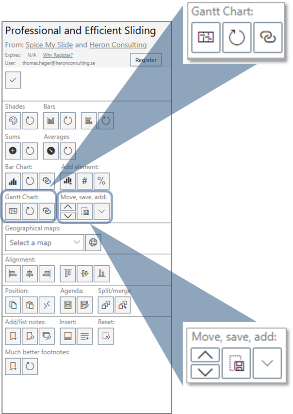
The first button (Add Gantt) will insert a standard Gantt chart with six rows and six months (starting with the current month) on your slide. Follow the instructions below to change the timeline, add months, rows, bars, or milestones or to resize the chart
The Refresh button is almost universal. You will use it for most things when you work with the Gantt chart. To resize the timeline, simply change the size of one of the months and (with the month shape still selected) click the Refresh button and all months will be given the same size (and updated positions). It works the same way with changing the size of the row labels. Just change the height and width of one label and click Refresh to that size being applied on all labels. This is also how we change the size of the chart as such (by changing the size of the month and row label components). The same for changing the timeline as well. Just update the value in the first month and click Refresh to see the rest of the timeline being updated accordingly.
The “Remarry” button is used if you copy an existing Gantt chart. In such case you will need to redefine the relations for the new set of chart shapes. This is done by keeping all the relevant shapes selected and clicking the “Remarry” button. After this step, the two charts are independent and can be updated separately without any interference from each other (which would be the case without the “remarry” step).
The Move up / Move down button will move the selected label / row up or down.
The Save Positions button is there to make sure that any updates you do to the positions of time bars or milestones are properly preserved. Click Save Positions after updating any positions of bars or milestones. This helps the tool to separate between position changes that are intended and those that might come from repositioning the whole chart or possible mistakes in the editing.
The last button is to add new elements to the chart. There are four kinds of elements you can add: bars, milestones, rows and months.
Milestones and bars belong to a specific category and you need to have the intended “parent” category selected when clicking Add MS or Add Bar.
To add a new Row, you need to have the row, under which you want to insert the new row, selected.
To add a new month, you can have any shape selected as long as the selected shape belongs to the chart.
Work with positions
The first button will copy the position from the selected shape. You can then select another shape on any slide and use the second button to apply the copied position to this shape. The third button will swap the position between two selected shapes
Split and merge text
The first button will split the selected text box in individual text boxes – one for each paragraph
The second button will merge the selected textboxes to one textbox. The formatting from the first textbox selected will be applied. Text will be merged in order of selection
Recurring agenda
The first button will add a recurring agenda to your presentation. One separate slide for each line of text in the selected agenda textbox. Also the Header of the selected slide will be copied to the individual slides. The line of text represented by each slide will be bolded on each slide respectively.
The Update Agenda button will apply any changes made to the selected agenda text box to all the other agenda slides. You can use any of the existing agenda slides to make the changes and then click the update agenda button to apply the changes on all agenda slides. The original slide and text box used to create the recurring slide will not be covered by the automatic updates – so we recommend that you either delete that slide after creating the recurring slides or that you initiate all changes to the agenda slide range from this original slide and thereby keeping all related slides aligned.
Work with References
We are very proud of this new set of feature for References. It gives you the same type of features for Footnotes and Cross References as you are used to from Word. In addition we also have the “Content References” that let’s you cascade changes of frequently used terms and numbers throughout the presentation.
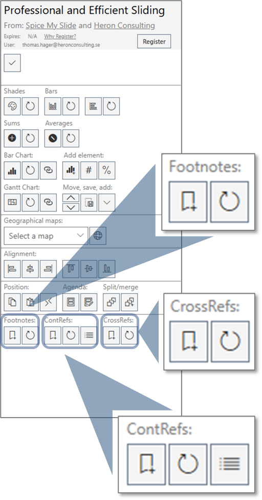
Footnotes
Use the Add Footnote button to insert a footnote index at your current position in a text box. In addition to inserting the index this will also insert a new line of text in the footer of the slide with the same initial index number and allow you to enter the text related to the footnote. This text will follow the index if it is moved to another slide or shape. If the footer textbox is deleted (but the index is still present on the slide) the footer textbox will be recreated when clicking Refresh Footnotes.
The Refresh Footnotes click will in fact regenerate all footer textboxes and indexes throughout the presentation and make sure that each index is correct (sequential numbering from start of the presentation) and that all references in the footers are aligned on each slide. You will notice that each index has a specific font color (very subtle versions of grey). This is part of the functional design of this solution and what keeps the index and footer text connected. Changing the font color of the indexes will break the connection. You will notice that each index has a specific font color (very subtle versions of grey). This is part of the functional design of this solution and what keeps the index and footer text connected.
Changing the font color of the indexes will break the connection. Be careful so the special font color is not carried along when you continue typing in the textbox. Unfortunately the current limitations in the APIs provided by Microsoft doesn’t allow us to automatically format the indexes as superscript. We recommend you to select the index and use keyboard shortcut “Ctrl, Shift, +” to do this manually. We will include this as soon as the relevant APIs are released.
Content References
This super clever feature lets you to define hashtags with values that can be reused throughout the presentation. If a hashtag is redefined the new values will automatically replace the old one for all occurrences in the presentation. This is how it works:
Type a text in any textbox like e.g., “#profit:12%” (without the quotes). Highlight the text you just typed and click the Define Reference button. This will replace the highlighted text and show only the value (what came after the “:”). Now you can use the tag #profit in your presentation and after clicking Refresh References the tag will be replaced with the latest value. If you add a hashtag to a textbox the first time the textbox should be selected when you click the Refresh References button. If you need to change the value you do the same thing as when you first defined it.
You can also see a full list of all hashtags active in the current presentation by clicking the Show References button. This will insert a textbox with all active hashtags on the current slide. Any updates you do to value in this text box will be applied after you click the Define Reference button (make sure to have the list textbox selected). Feel free to delete the list textbox when you don’t need it anymore. You can always recreate it with a click.
Cross References
Yes it is true! Now we finally have real support for cross references in PowerPoint. This means you can refer to other slides (with reference to the slide number) and you don’t need to worry about that slide number changing after rearrangements in the presentation.
This clever feature will keep track of the slide you originally referenced and make sure that the slide number always reflects that specific slide. This is how it works:
Highlight the slide number you have referenced in your textbox (only the actual number) and click the Add Cross Reference button. This will give the number a specific font color (again subtle shades of grey) that you need to keep how it is. After moving around your slides, you can just click Refresh Cross References button, and you will see the numbers in your textboxes (across the whole presentation) are updated to show the correct slide numbers.